Storybook으로 React 버튼 컴포넌트의 story 만들기
Storybook의 기본 단위인 story 개념, 설치 명령, styled-components 버튼에 Small·Large story를 연결하는 예제를 정리했습니다.
1분 읽기#React
2023년에 쓴 글이라 지금과 다른 내용이 있을 수 있습니다.
Storybook이란
Storybook은 컴포넌트 단위의 UI 개발 도구입니다. React 프로젝트 안에 있는 많은 컴포넌트를 문서화할 수 있습니다. Storybook의 기본 단위는 story이며, 보통 UI 컴포넌트 하나는 하나 이상의 story를 가집니다.
설치
리액트 설치
text create-react-app@latest first-storybook --template=typescript
스토리북 설치
npx -p @storybook/cli sb init
버튼 컴포넌트 만들기
javascript
import styled from "styled-components";

interface NewButtonProps {
    label: string;
    size: "small" | "large";
    onClick?: () => void;
}

function NewButton({ label, size, onClick }: NewButtonProps) {
    return (
        <NewButtonStyle size={size}>
            <p>{label}</p>
        </NewButtonStyle>
    );
}

const NewButtonStyle = styled.div<{ size: "small" | "large" }>`
    background-color: red;
    color: whitesmoke;
    width: ${(props) => (props.size === "small" ? "75px" : "200px")};
    height: ${(props) => (props.size === "small" ? "75px" : "200px")};
    display: flex;
    align-items: center;
    justify-content: center;
`;

export default NewButton;
컴포넌트에 story 연결하기
javascript
import { ComponentMeta, ComponentStory } from "@storybook/react";
import NewButton from "./newButton";

export default {
    title: "Components/NewButton", // story 이름
    component: NewButton,
} as ComponentMeta<typeof NewButton>;

const Template: ComponentStory<typeof NewButton> = (args) => (
    <NewButton {...args} />
);

export const Small = Template.bind({});
Small.args = {
    size: "small",
    label: "small",
}; // Small의 props 지정

export const Large = Template.bind({});
Large.args = {
    size: "large",
    label: "large",
};
// Large의 props 지정!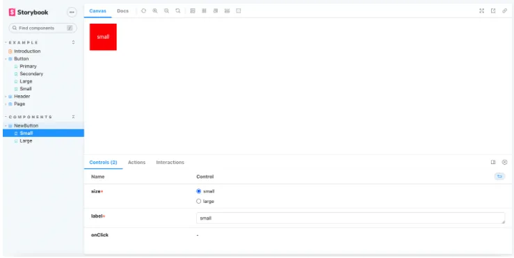
같은 주제의 글
스켈레톤 로딩 UI를 어디에, 언제 보여 줄지 정한 기준
스켈레톤 UI를 전체 화면과 일부 영역으로 나눠 적용한 기준, Suspense와 MUI Skeleton으로 만든 부분 로딩, 짧은 로딩에는 스켈레톤을 숨기는 지연 컴포넌트와 이미지용 공통 컴포넌트를 정리했습니다.
Recoil 훅 정리: useRecoilState부터 스냅샷까지
useRecoilState·useRecoilValue·useResetRecoilState와 selector의 set, useRecoilSnapshot·useRecoilTransactionObserver·useRecoilCallback으로 스냅샷을 다루는 법을 정리했습니다.
4분 읽기#ReactSWR suspense 옵션으로 로딩 삼항 연산자 걷어내기
SWRConfig에 suspense: true를 켜고 React Suspense의 fallback으로 로딩 UI를 맡기는 방법을 정리했습니다. React Query도 같은 방식으로 씁니다.